Tag: charts
-
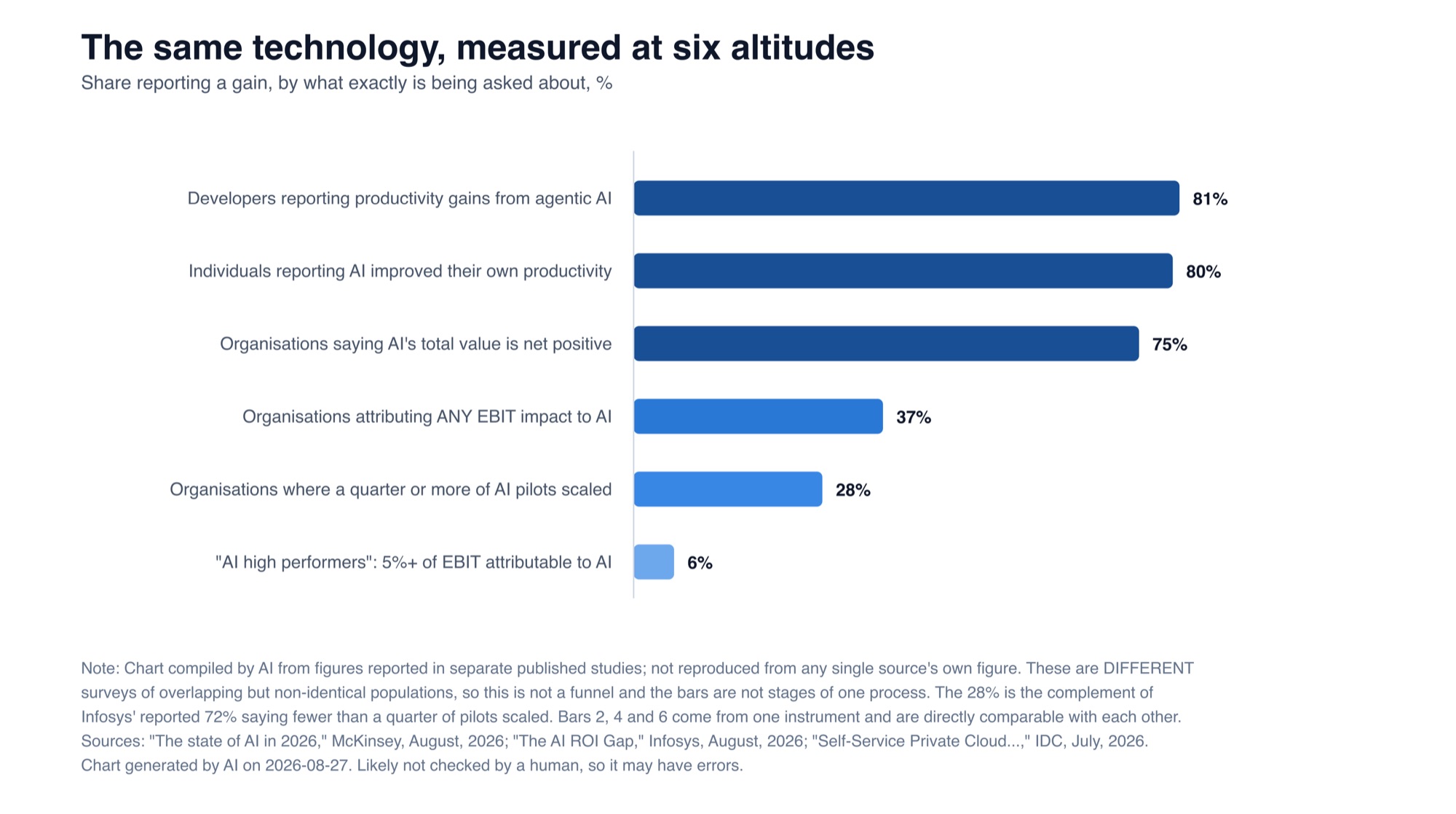
AI is valuable to the individual, less so to the organization
Ask an individual if AI made them more productive and about four in five say yes. Ask an organization if it moved EBIT and it’s fewer than two in five, and one in sixteen for anything you’d call real. A chart pulling three August surveys together, plus why the goal should be getting better at…
-
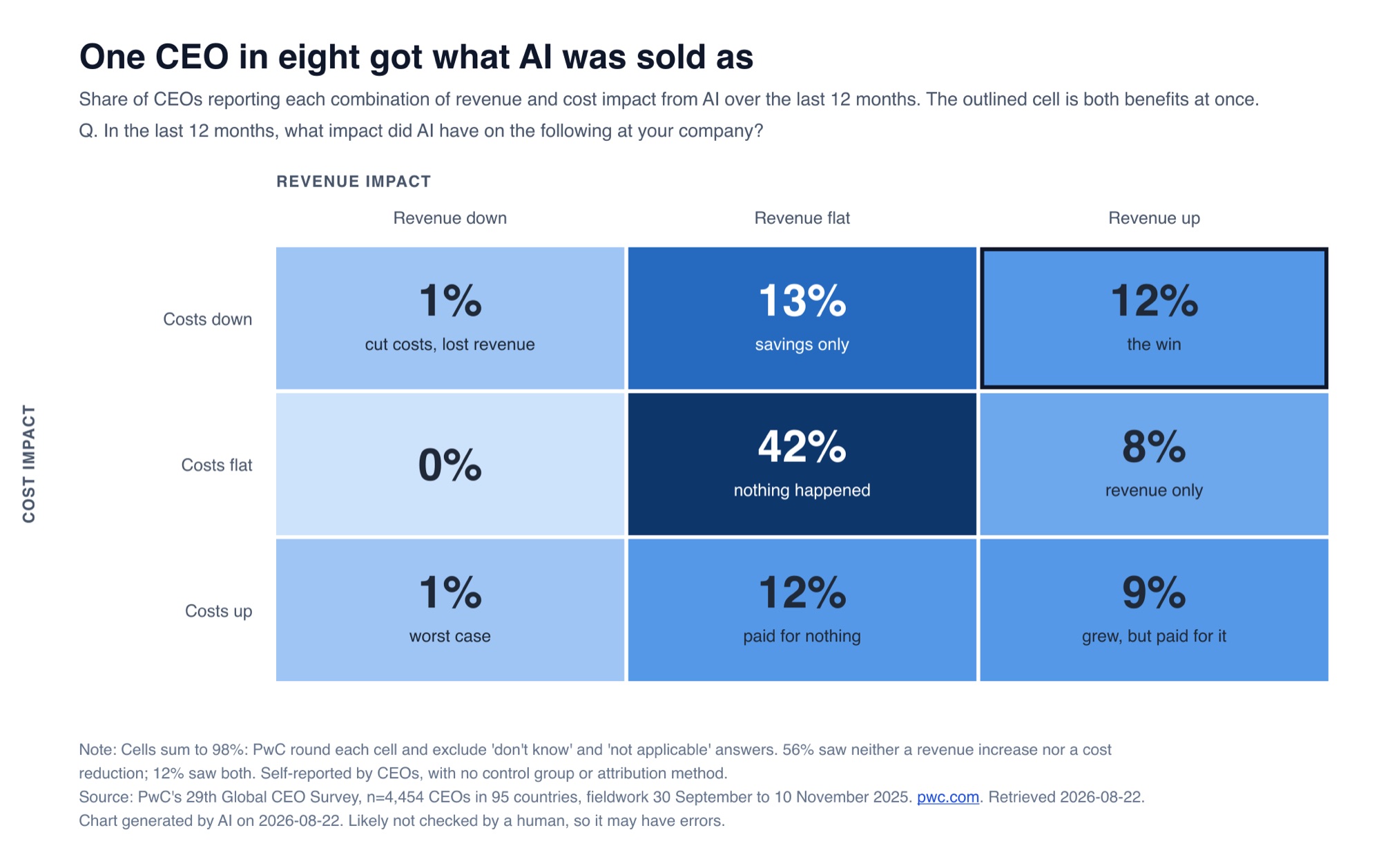
One CEO in eight got what AI was sold as, survey
PwC asked 4,454 CEOs what AI did to their revenue and costs over the last twelve months. The biggest single box on the matrix, at 42%, is the one where nothing moved. One in eight got both benefits at once, and 13% came out worse.
-
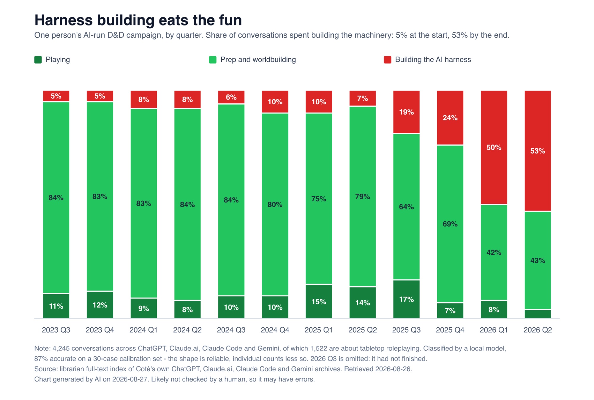
Using AI to play Role Playing Games – Building tools to play Dungeons and Dragons is playing D&D…?
I wanted to see how much time I spend playing D&D with AI versus building the tooling for playing D&D with AI. Charted across 4,245 conversations back to 2023: harness building goes from 5% to 53%. The cobbler’s curse – you love making shoes so much you never walk around in them.
-
Bedazzled by slides and data
During the 2000s, slides became even more ornate. Consultancies evolved their formatting rules, and created fancy data-dense charts. They learned that a 200 slide deck made clients feel like they got a lot for their money. E.g.: I vividly remember being shown the charts room in fund manager Fidelity’s huge London office. There were graphs…
-
The charts say things are OK
It’s astonishing that the richest country in world history could convince itself that it was plundered by immigrants and trade. 🔗 One-Third of US Families Earn Over $150,000
-
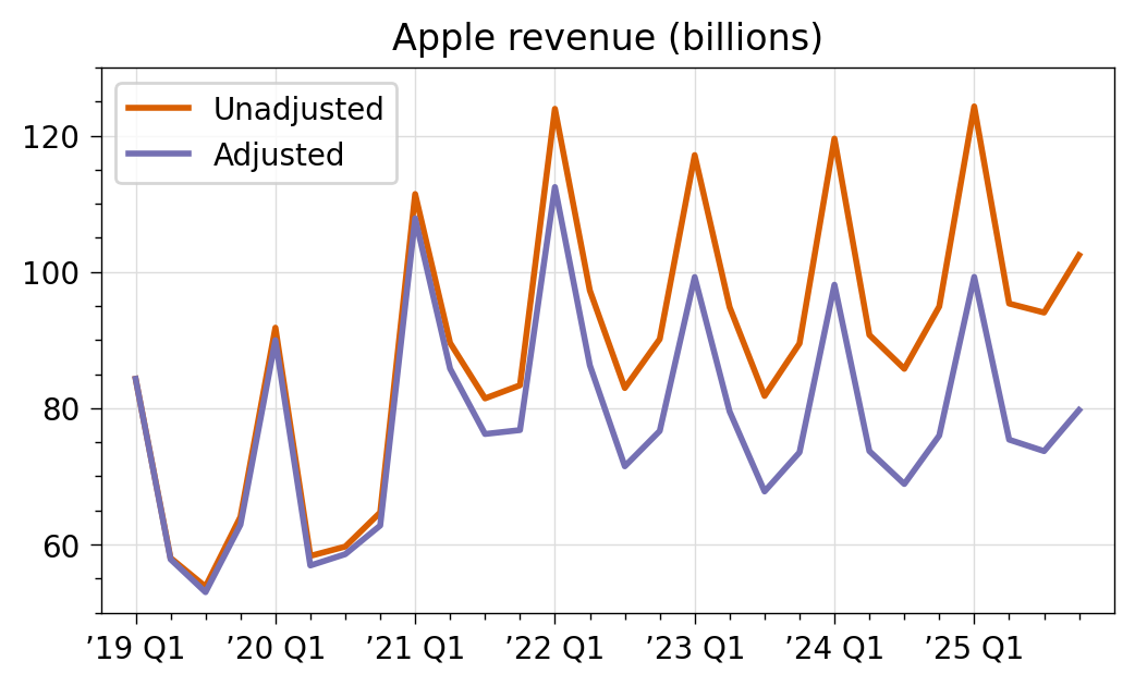
Apple’s inflation adjusted revenue
Applying inflation to Apples’s revenue makes it more flat. // The same would apply to other companies. 🔗 The problem with dollars
-
Still a lot – private cloud check-in, Spring 2025
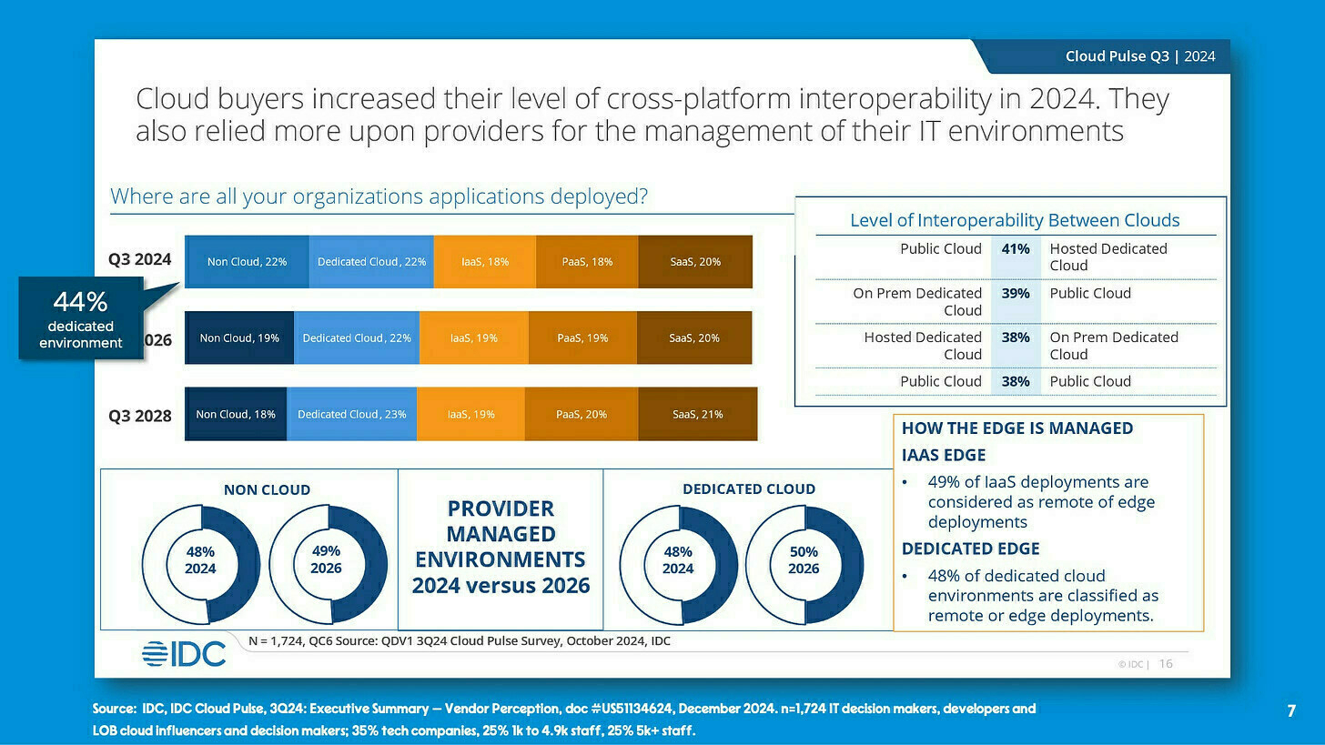
Where are the workloads? Let’s check in on how much private there is nowadays. I think it’s somewhere in the range of 40% to 60% of workloads1 globally. If you narrow down to “enterprises” (let’s say organization that have 5,000, even 10,000 employees), my sense is that the number goes way up, maybe 70%. The…
-
Schooled by Trump, Americans are learning to dislike their allies – ‘last year 17% of Republicans viewed the EU as “unfriendly” or as an “enemy”; that has now grown to 29%.’
-
Data Looks Better Naked – Good advice on formatting charts and data tables. The examples are incremental, so you can choose to go all the way, or just apply some of the design changes.
-

There’s a lot of apps running in private cloud – surveys and charts
Fun with charts: Relative to your interests How Cloud Ingestion Pricing Eats Your Budget – ”Essentially, yes, the cloud can be cheaper — but only if you’re using it the right way.” Microsoft and Google Are Forcing Customers to Adopt AI at a Premium Price: What Customers Need to Know – “84 million customers x…
-
Alternatives To Typical Technical Illustrations And Data Visualisations – These look cool, but I had to spend a lot of time figuring them out. Bar charts are boring, but they’re efficient. Still, I want to try some of these.
-

What people buy for Kubernetes
Where the Kubernetes spend is Here’s a presentation recording going over our recent Kubernetes survey. I’ve mentioned it several times here, but there’s some new charts (like the above) and commentary in this talk I did with Rita and Danielle. Check out it for free in LinkedIn. Wastebook 1 cup toilet chemical solution, three cups…
-
How Much Revenue Must a Company Generate to IPO? – “Before 2018, only one company IPOed with more than $200m in revenue. In fact, the median revenue at IPO at $90m. Today, the median revenue at IPO is $189m (corrected for inflation), more than double.”
-

Lots of Marvel super heroes this halloween, but a little more clowns than the last two years
Not much today. Halloween Clown Tailwinds From Chris Rogers at S&P Global Market Intelligence. “Among outfits, the best performers have been those linked to clowns, which increased by 43% year over year.” Somewhere, there’s a financial analyst who really cares about the increase in clown costumes this Halloween. Wastebook “So I quit my job as…
-

IncrementalOps
Beware of High Expectations in Enterprise Tech Here are three charts. First, while everyone is freaking out about AI, it’s had little impact thus far: Shared by Mark Hinkle. Second, since 2020, usage of cloud seems to have leveled off at a 50/50 split between on-premises and public cloud: Source: IDC, The Evolution of Cloud…
-
The Narcissism of Small Differences in Charts
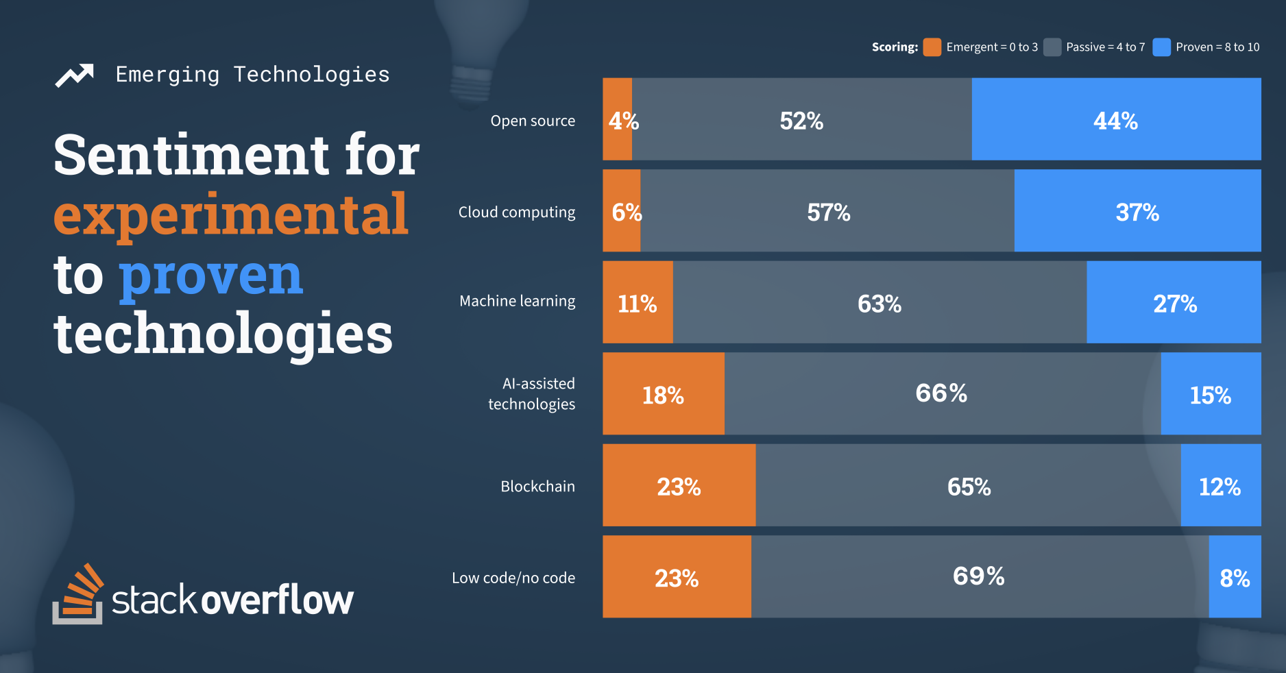
The Narcissism of Small Differences in Charts In surveys, just because something is last doesn’t mean it’s bad. It’s true the other way as well. Now, if there’s a huge difference between the first and last thing, then, sure. If 85% of people like the first choice, and 15% like the last, you’ve got a…
-
Link: Technology Spending by the Numbers: From Public Cloud to Security Measures – TheStreet
Nifty chart. Original source: Technology Spending by the Numbers: From Public Cloud to Security Measures – TheStreet
-
Link: Your Omnichannel Roadmap
It’s got a quadrant chart. Original source: Your Omnichannel Roadmap
-
Link: Green light for IT spending in 2018
“fully 50% of the 872 respondents said their company is giving a ‘green light’ for IT spending. That was the highest reading since 2007, and 13 basis points higher than the average survey response for the month of November for the previous five years” Original source: Green light for IT spending in 2018
-
Link: How smart speakers stole the show from smartphones
“In the first nine months of 2017, 17.1m smart speakers shipped worldwide, according to Canalys’s data, but a further 16.1m were shipped in the last quarter of the year driven by Christmas present sales…. The trend towards smart speakers becoming mainstream is expected to continue. Canalys is forecasting 70% year-on-year growth with shipments reaching over…
You must be logged in to post a comment.